Design library
One primitive set, composed into two product domains
A framework-free Angular component library: thirty primitives that own their own CSS custom properties, with no Material and no third-party component dependency. What makes it a design system rather than a component collection is the layer above — two unrelated product domains, real estate and personal finance, each assembled from the same primitives and each themed by overriding tokens rather than by overriding styles.
93 published stories in Storybook
Primitives
Prefixed `dlc-`, themed entirely through CSS custom properties, and free of any component framework.
 ButtonThe full variant set — solid, ghost and icon — over a single token contract.
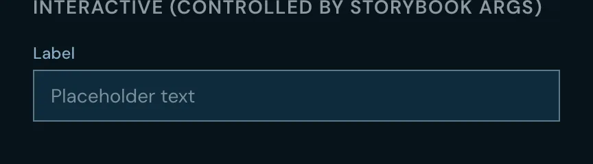 InputA text field with label, hint and error states.
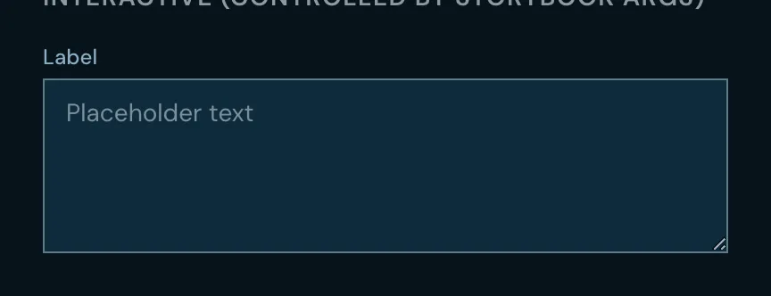 TextareaA multi-line field sharing the input’s label and error treatment.
 SelectA single-choice dropdown with full keyboard navigation.
 CheckboxA checkbox with a real indeterminate state, not a styled approximation of one.
 ToggleA binary switch with distinct labelled on and off states.
 StepperNumeric increment and decrement around a bounded value.
 Search inputA text field with a clear affordance and debounce-friendly output.
 ChipA compact, optionally removable tag.
 BadgeA small count or status marker attached to another element.
 AvatarA user image with an initials fallback.
 IconThe registered icon set, resolved by name rather than by import.
DialogA focus-trapped modal surface with a backdrop. TooltipAn anchored hint that positions itself against the viewport edge.  Progress barDeterminate and indeterminate progress in one component.
 Battery meterSegmented step progress — each segment carries its own state, coloured from an overridable map.
 Stats cardA labelled metric with an optional delta against a prior period.
 Analytics cardA metric paired with its own inline chart.
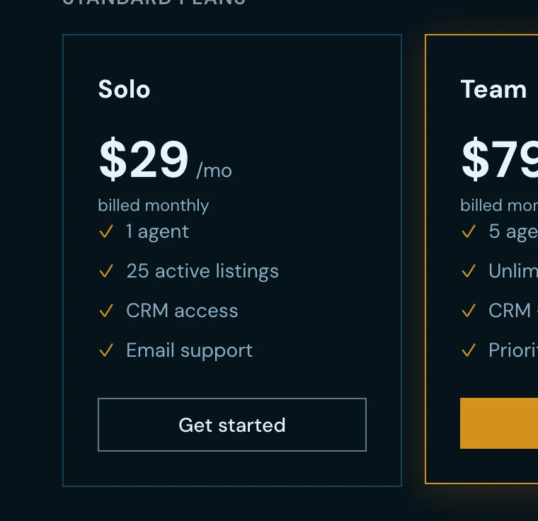 Pricing cardA plan tier with its feature list and call to action.
 Billing toggleThe monthly-and-annual switch that sits above a set of pricing cards.
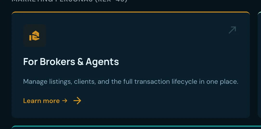 Persona cardA card presenting one role or persona, with an optional inline contact block.
 Role switcherA control for changing the acting role in a multi-role application.
 Photo carouselA swipeable image sequence with keyboard support.
 Feature showcaseA captioned screenshot inside browser chrome, a hand-held device frame, or neither.
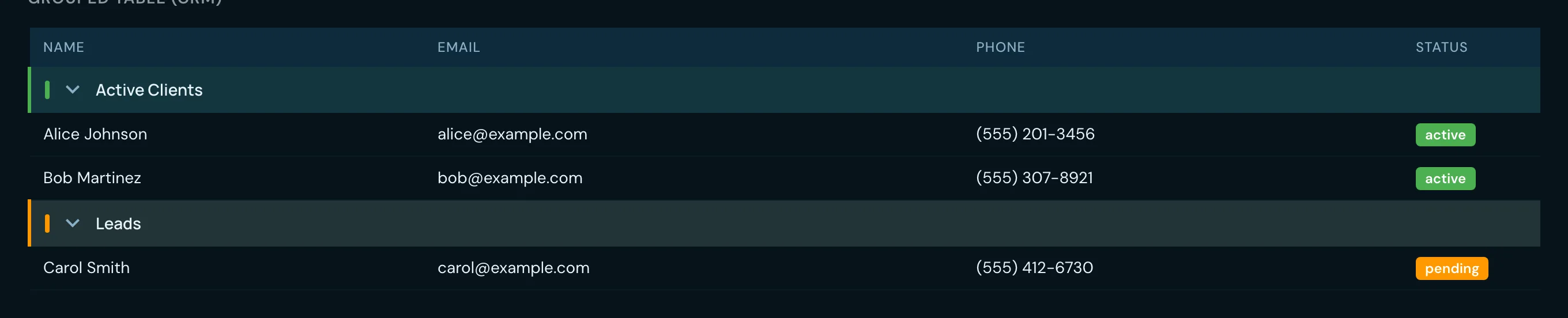 Data tableA lightweight table for simple tabular content, distinct from the full data grid.
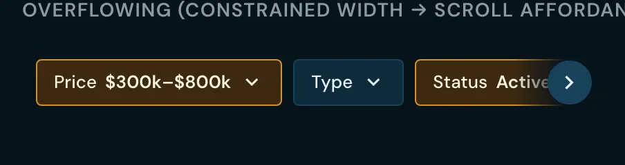 Filter barThe horizontal container that arranges, wraps and collapses a set of filters.
 Filter popoverAn anchored panel holding one filter’s controls.
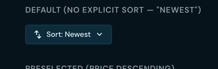 Sort controlA direction-aware sort trigger for a column or a list.
 Deleted badgeA soft-delete marker that counts down the days remaining before the record is purged.
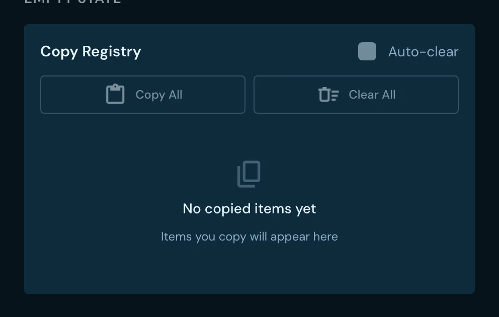 Copy registryA staging list of copyable snippets, each optionally tagged, emitting copy and remove.
Composed for a real-estate domain
Each of these is assembled from the primitives above — the filter bar, popover, select and stepper — rather than styled from scratch.
Address autocompleteA composed address field with suggestion list and selection state. Property preview cardThe card summarizing one listing in a result set. Property type filterFiltering by dwelling category. Square footage filterA bounded range over interior square footage. Lot size filterA bounded range over parcel size. Radius filterDistance from a chosen point, as a selectable radius. Year built filterA bounded range over construction year. Sold date filterNarrowing by transaction date. Status filterNarrowing by listing status. Favorites filterRestricting a result set to saved listings. Notes filterRestricting a result set to listings carrying an annotation. Ratings filterNarrowing by rating threshold.
Composed for a personal-finance domain
A second domain layer over the same primitives — 19 further stories — and the front end of the running Ledger demo.
Account cardA balance and institution summary for one account. Amount inputA currency field with sign handling and a constrained keypad. Budget cardSpend against an envelope, with the remainder called out. Category chipA category tag carrying its own colour from the category model. Donut chartThe spend-by-category ring, bridged onto the charts library’s tokens. Empty stateThe zero-state surface, with its prompt toward the first action. Header barThe application bar, with title, back affordance and actions. Icon buttonA compact icon-only action. Page contentThe scrolling page body, with its safe-area and footer handling. Theme switcherThe persona and light-dark switch, wired to the theme tokens.